Sponsor: Micromeretics
Project Partner: Rebecca Nicoara
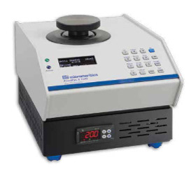
Micromeretics is a global leader in designing and manufacturing scientific equipment, specializing in material characterization. For this project, they asked us to redesign their AccuPyc II pycnometer, and in doing so create a new visual brand language that more accurately reflects the personality and core attributes of their company in the design of their products.
Research
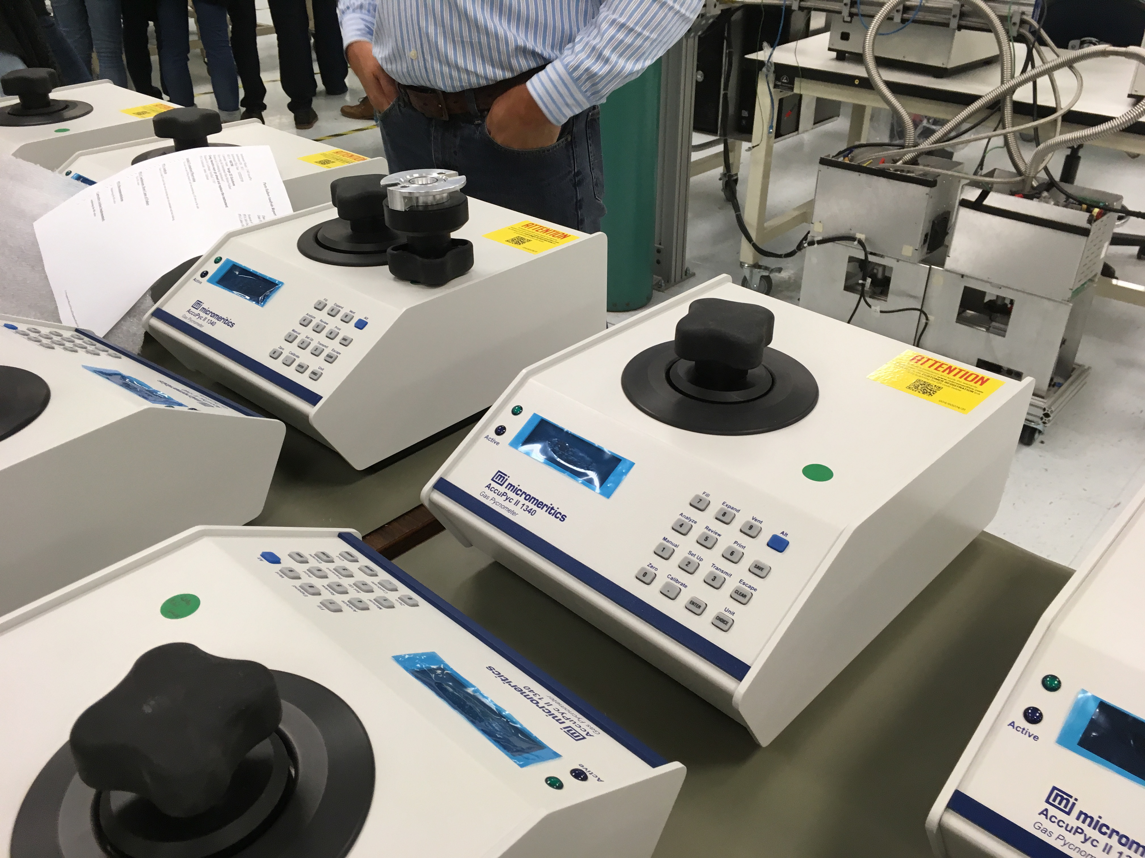
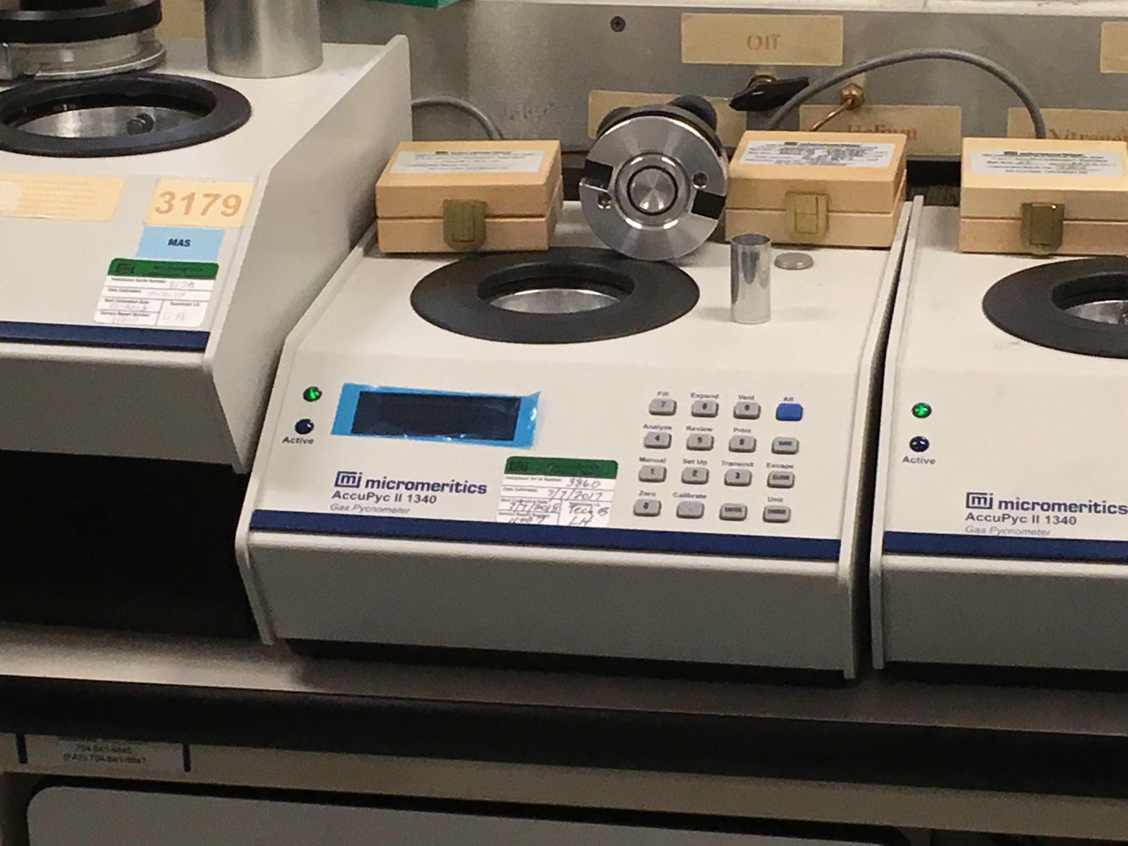
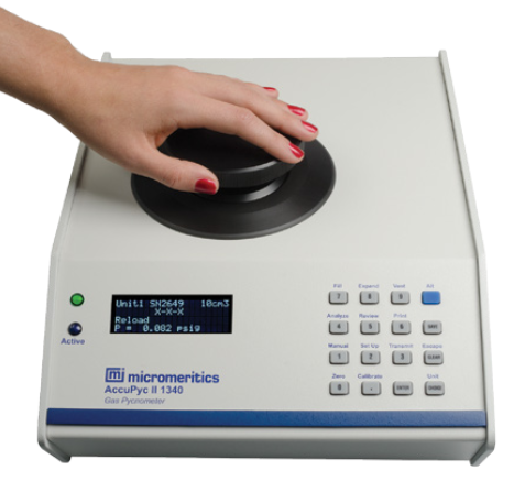
We visited the headquarters of Micromeretics in Norcross GA to better understand the company as a stakeholder in the project and to gain additional insight into Micromeretics as a brand. While there, we had an opportunity to see the product being manufactured and also to see it in use in their laboratory. We also visited Argos, where the AccuPyc is used in to test concrete samples.

How Do We Make It Better?
User Feedback
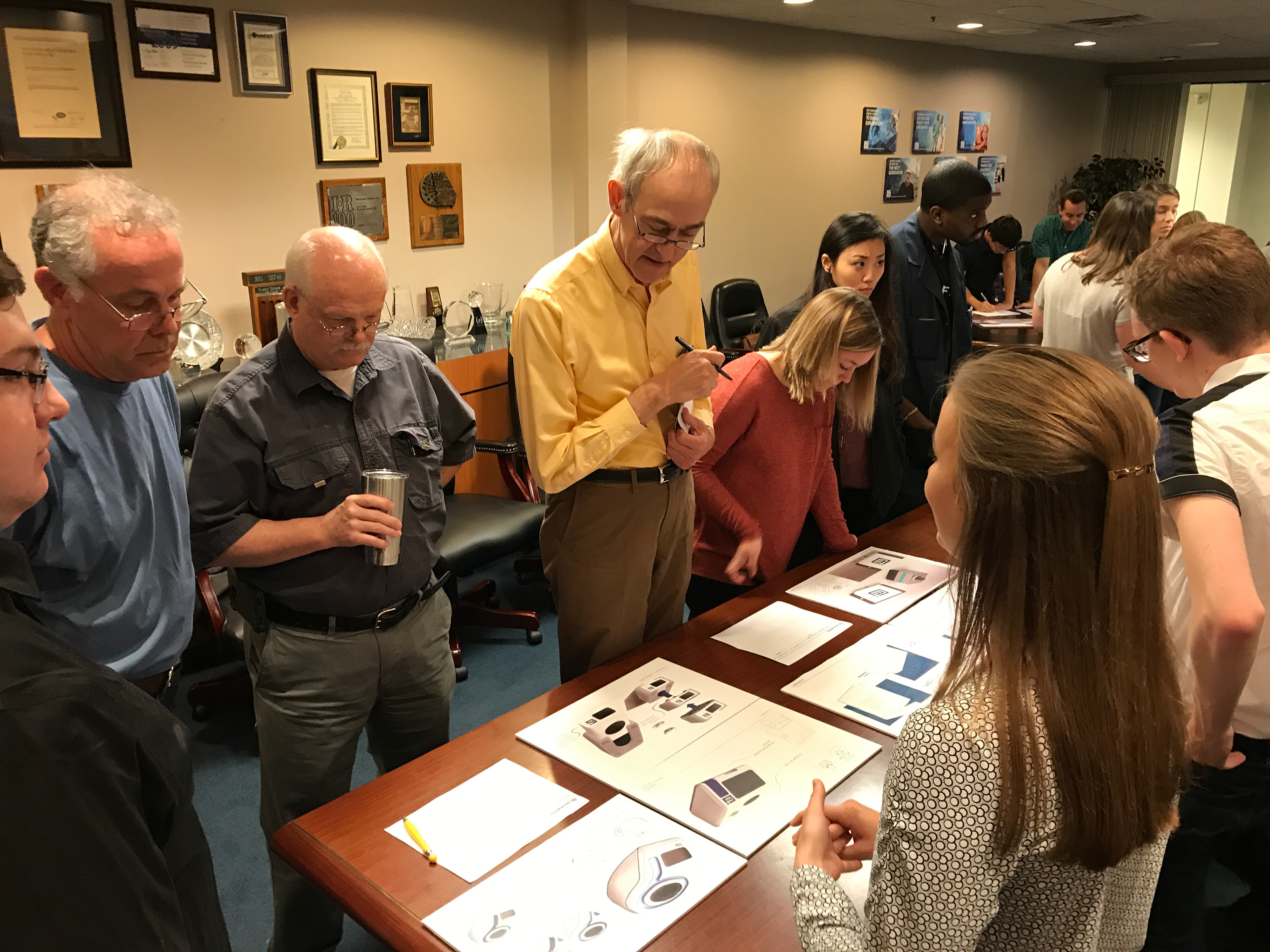
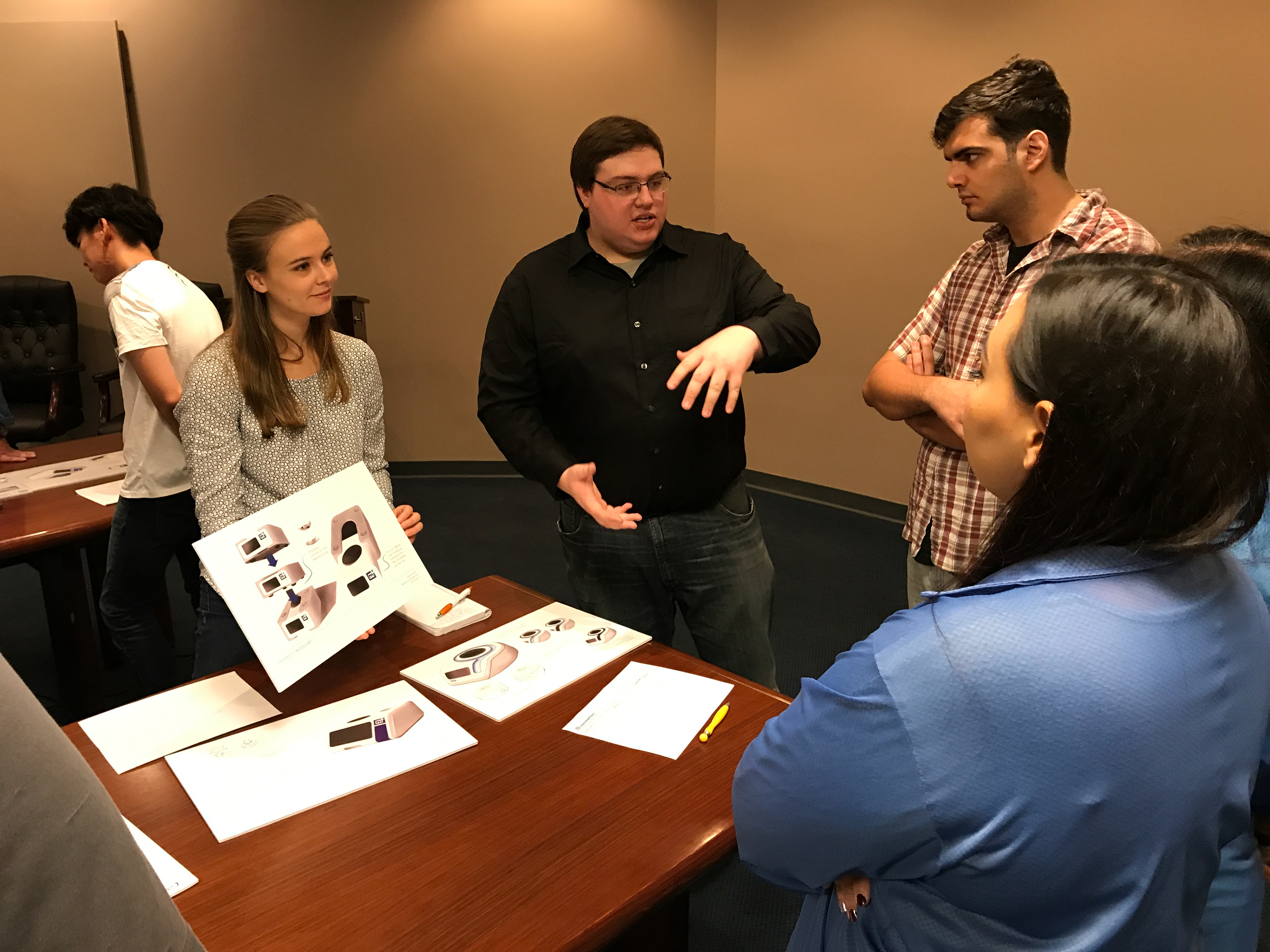
After developing our 3 distinct concepts we once again visited Micromeretics with our studio to get feedback that would help us refine our direction moving forward. We received a mountain of valuable feedback from a variety of people at the company from engineering and design to machining and service.
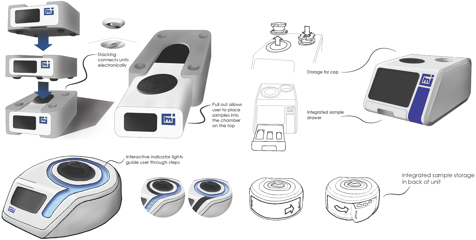
What we learned: Concept 1
• Cap storage space raised concerns over the
cap’s O-ring seal.
• Calibration tools might not be used
frequently enough to justify the added
complexity.
• People enjoyed the new form and its
beveled edges.
cap’s O-ring seal.
• Calibration tools might not be used
frequently enough to justify the added
complexity.
• People enjoyed the new form and its
beveled edges.
Concept 2
• Rounded form would be much more difficult
to create using sheet metal.
• Rear storage is an issue because gas lines
and connections are located there.
• Indicator light was extremely popular,
especially amongst technicians.
to create using sheet metal.
• Rear storage is an issue because gas lines
and connections are located there.
• Indicator light was extremely popular,
especially amongst technicians.
Concept 3
• Reduced footprint was appreciated.
• Stacking would add too much complexity as
the gas lines going into the chamber would
have to be made flexible
• Stacking presented concerns about stability.
• Stacking would add too much complexity as
the gas lines going into the chamber would
have to be made flexible
• Stacking presented concerns about stability.
Creating a Visual Brand Language
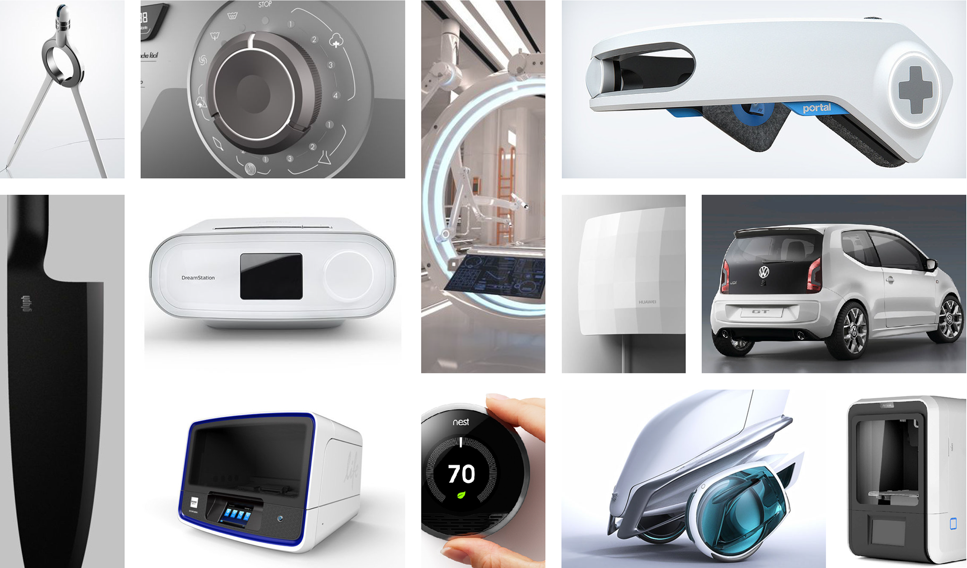
To build a new Visual Brand Language for Micromeretics, we wanted to build off of their core values of science and technology, as well as accuracy and reliability and communicate these values visually. To do that, we established three defining attributes that would guide the design of Micromeretics products.
We Created a mood board with images of products that exemplified the three attributes that we wanted the new Visual Brand Language to embody: Precise, Futuristic, Intuitive
Signature Elements
To complete our visual brand language, we used our mood board and created some specific signature elements to be applied to the new AccuPyc and potentially more Micromeretics products.
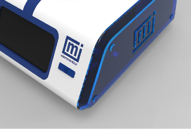
Beveled Edges
Inspired by a knifes edge, adding crisp bevels to the sides of the product reinforce the idea of precision.
Integrated Indicators
Larger and more visible indicators, that are integrated into the product’s form, guide the user and make information more accessible, thus reinforcing the intuitive aspect of the new VBL
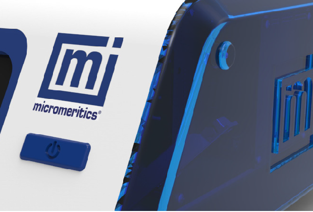
Material Change
Having stark contrast between two materials with a clean dividing line also emphasizes precision.
Simple and Minimal Form
Retaining a simple overall form which inherently emphasizes the user interface also adds an intuitive quality to the design.
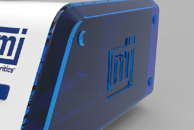
Translucent Panels
Translucent panels show off the technology and innovation at the core of Micromeretics products and add a futuristic aspect to the look of the product.
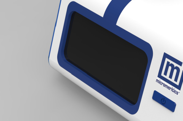
Single Accent Color
Increasing the role of an accent color in the design can emphasize certain user interface features as well as give the product more character.
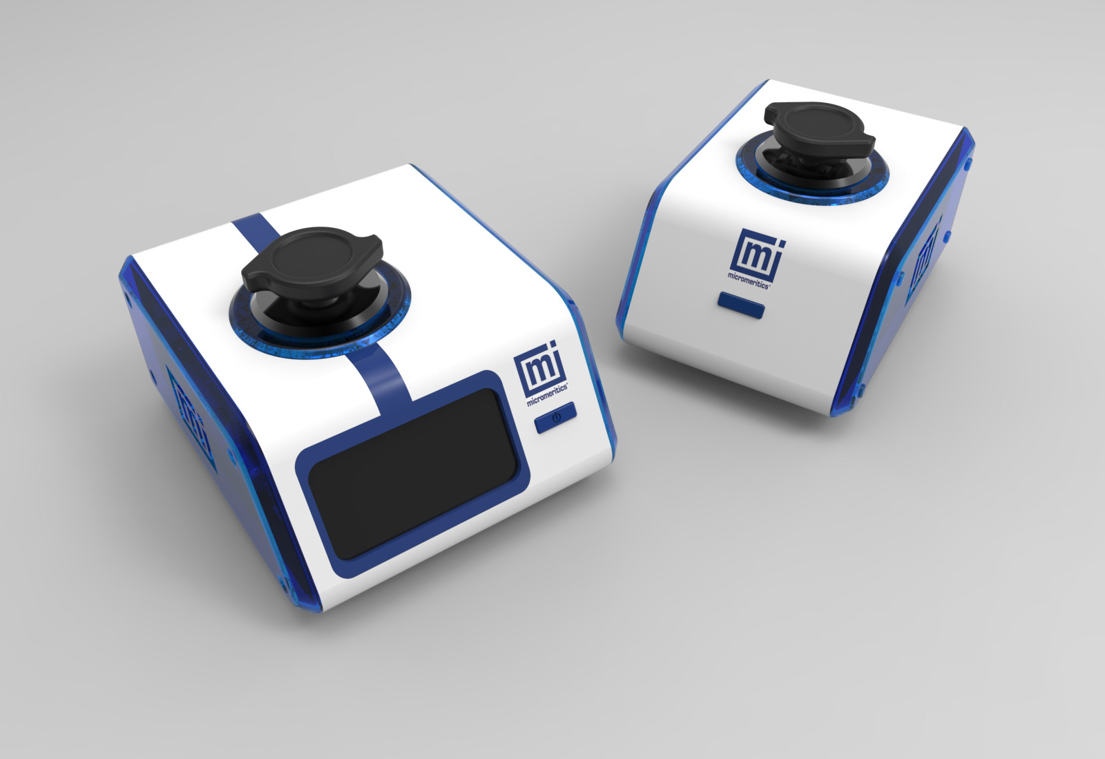
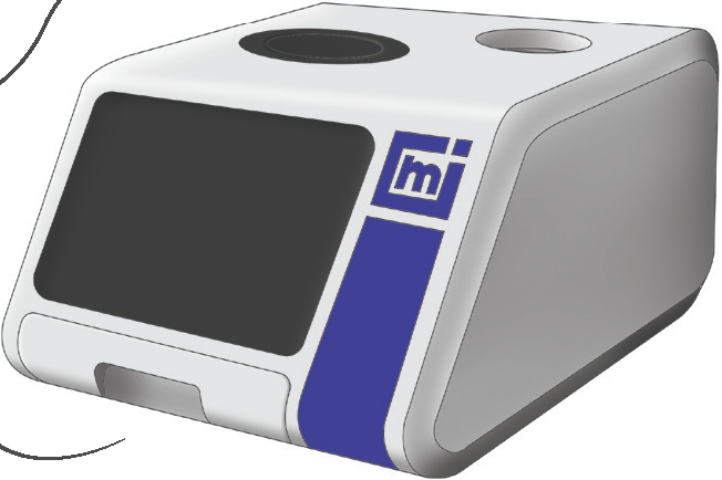
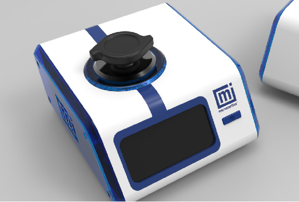
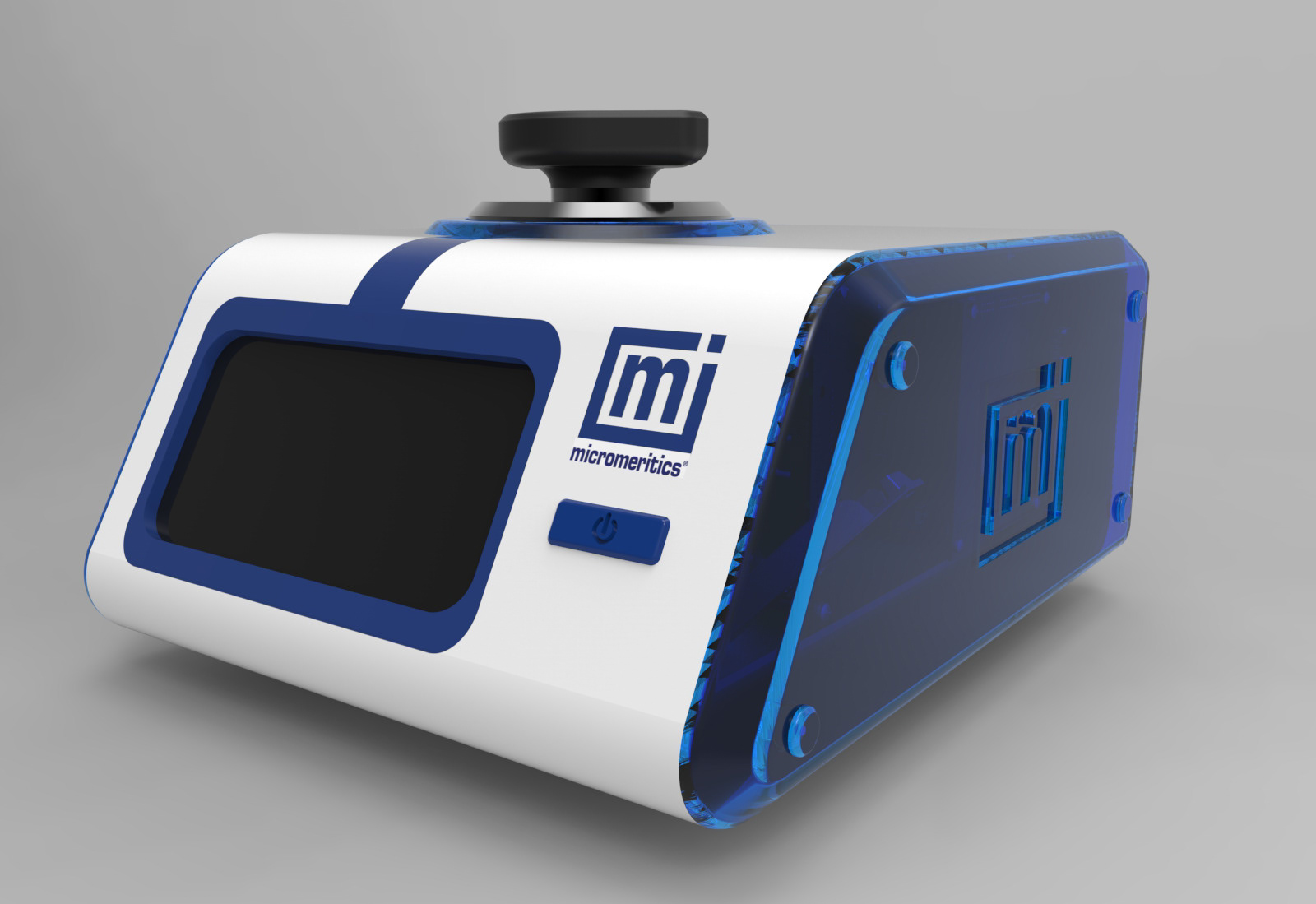
Final Concept
The new Accupyc design utilizes all of the signature elements in the new visual brand language and combines them into an elegant package that includes several innovative features. The new design represents a potential new era for Micromeretics, paving the way for future products that accurately reflect the company’s scientific and innovative values.
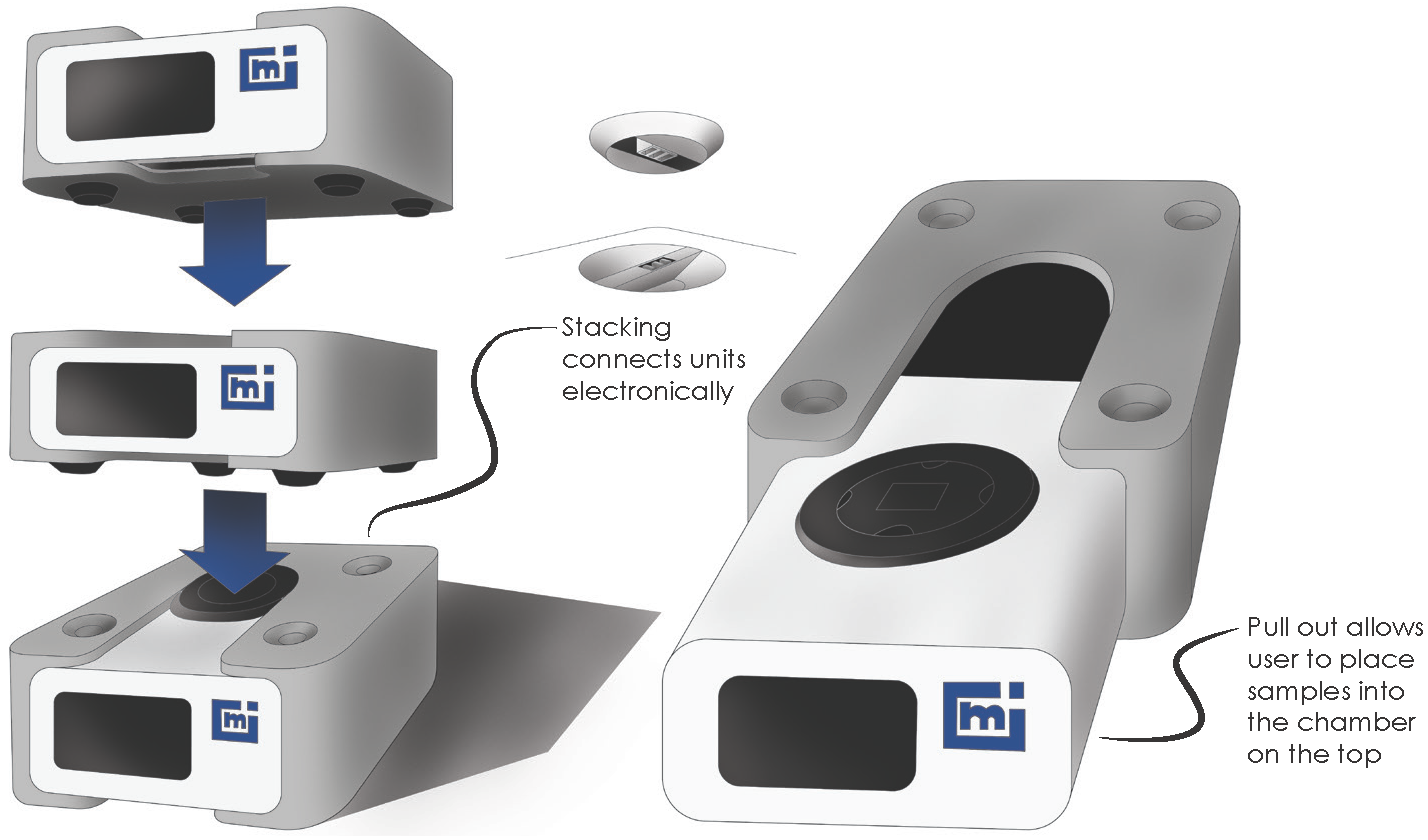
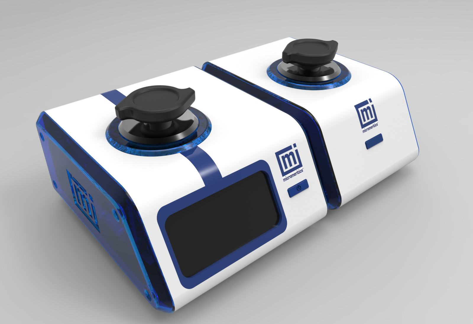
Modular
The idea of modular connectivity was carried over to the final design. Electrical and data connectors are built in to the sides of the case, allowing multiple units to be daisy-chained together simply by physically moving them against each other. This feature greatly reduces the number of cables necessary, making for a more organized workspace.
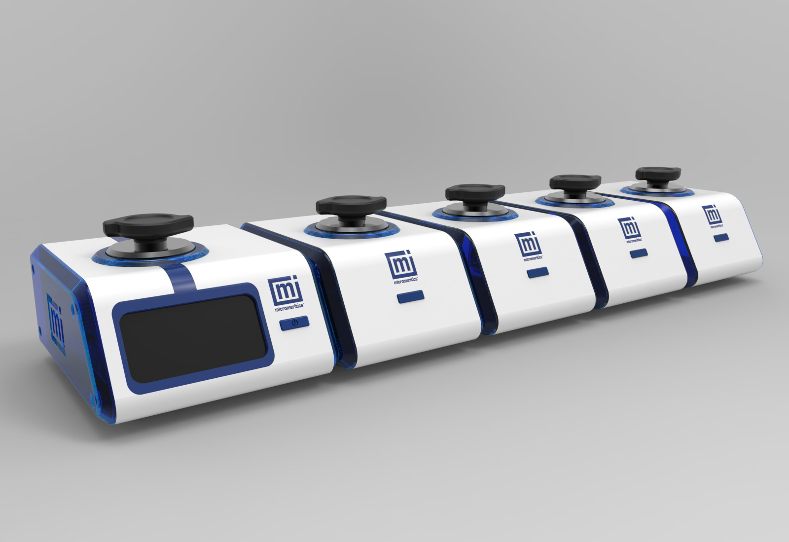
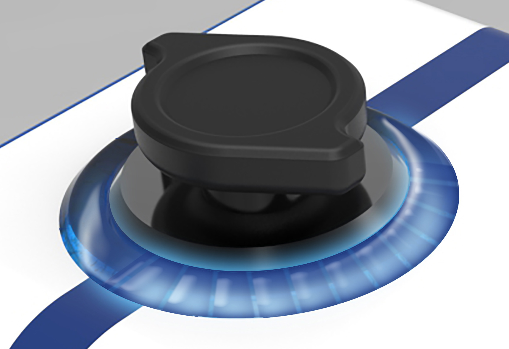
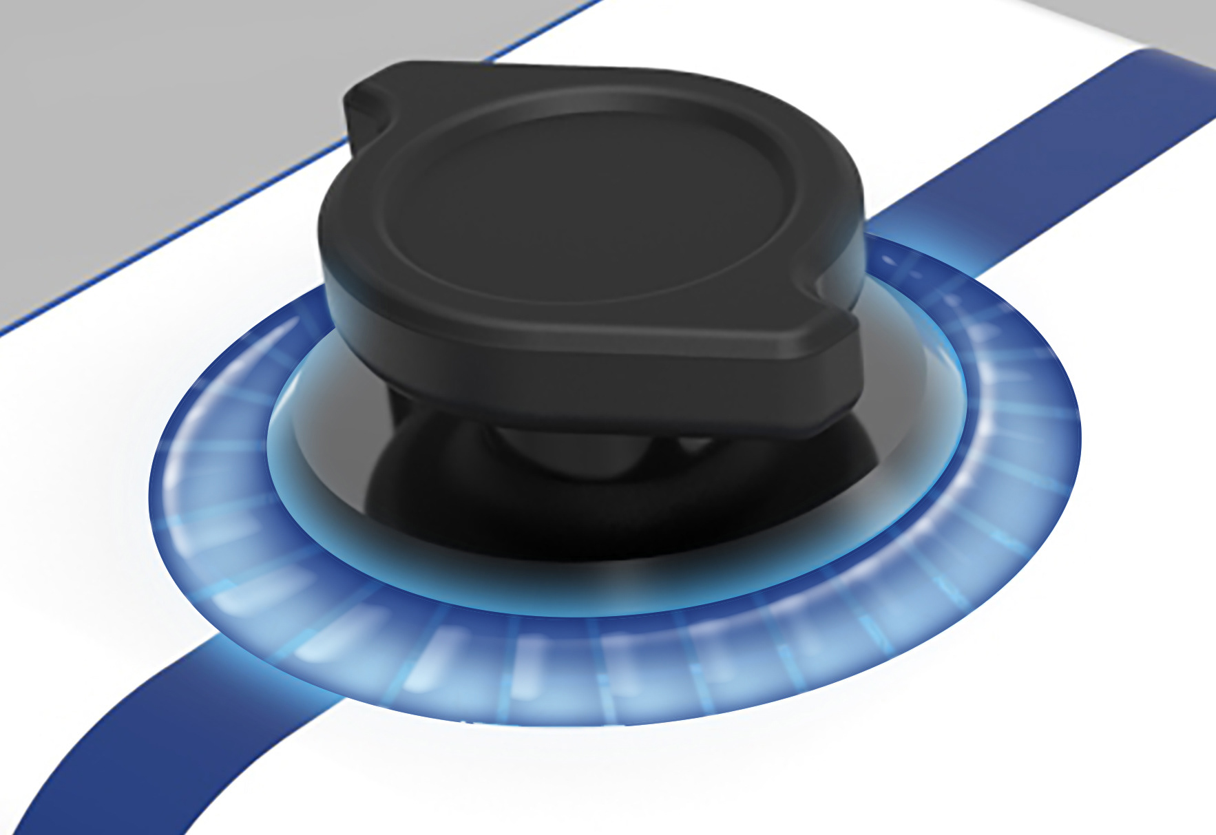
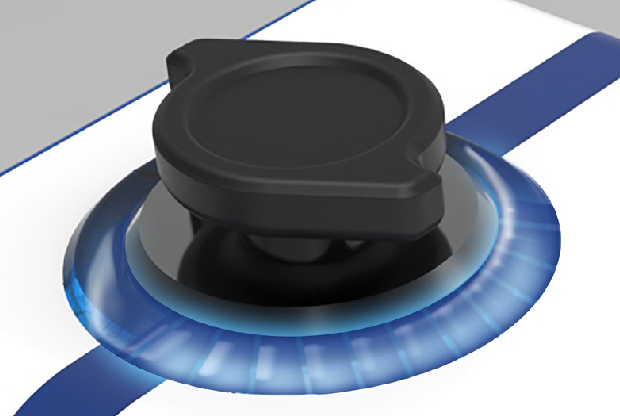
New Cap Design
The new cap is designed to be more ergonomic and provide greater leverage when opening the sample chamber.

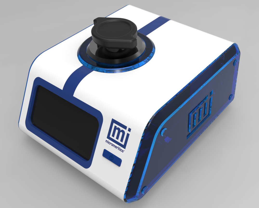
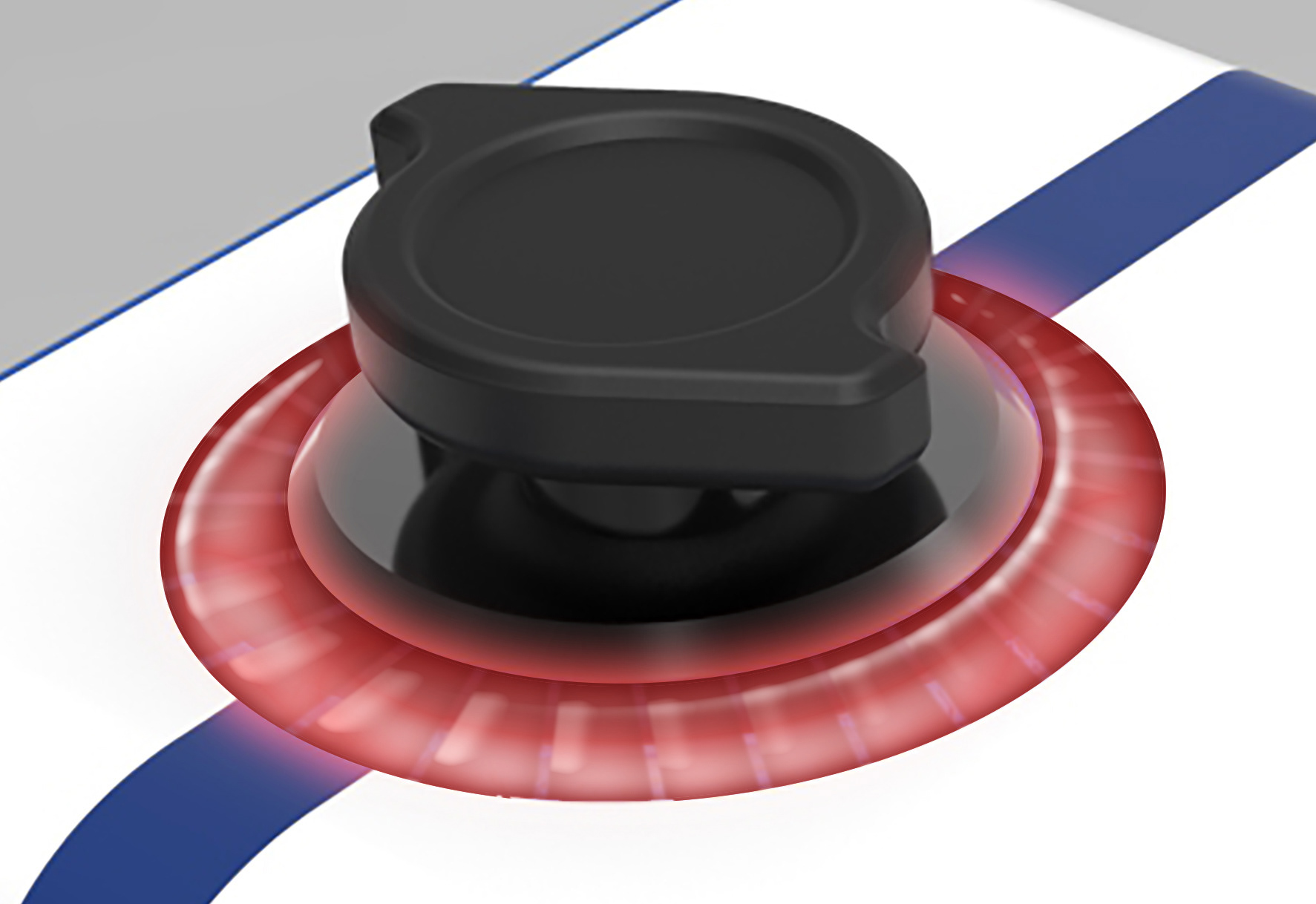
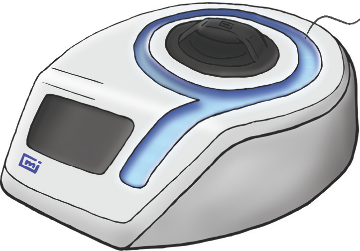
Integrated Indicator
Integrating a status indicator into the cap bezel allows lab technicians to quickly and easily determine the currents status of the unit or even its progress with just a quick glance. This saves valuable time in the lab.